Spring 2019

spring and summer trends.

one of the best things about spring in the design world is the High Point Furniture Market in North Carolina.  there are now several large markets throughout the year; but High Point is the original and best. 

a quick summary of what happens at High Point.  designers get to see all the new introductions from furniture – artwork – upholstery (the list goes on and on….) manufacturers from all over the world. most introductions won’t be available to consumers for many month’s but we get a sneak peak and a chance to place orders first.  it is a great place to see the upcoming trends for the year in all things design.

black was still strong and you will see that in some of my favorites from market. the great thing about black is that you can soften it with a more muted palette or make it stronger by interjecting some bold primary colors.

  • gray has been toned down with some brown for more of a woodland vibe

  • mossy green looked great in velvet and leather

  • burnished gold was stunning in furniture accents and accessories

  • blues in all shades but I loved the blues that were a little more subdued and faded with pops of a deeper navy and natural saffron.

that look has inspired a new model home we are working on!

 
tempaper.png

tempaper

this has long been one of my favorite companies. they have a stunning new line of murals from Zoe Bios that are on trend with their use of color and graphics. we are using this one in a teen bedroom. www.tempaper.com

 
arteriors-desk.png

arteriors

this desk from Arteriors is high class all the way – we are using it in a formal library with a chartreuse linen wall treatment. www.arteriorshome.com

 
interlude-home.png

interlude home

this is going in a dining room with round burnished gold mirrors above to enhance the soft edges of the piece. www.interludehome.com

 
Picture4.png

green apple designs

unique and one-of-a-kind! we are using this in a contemporary foyer with a gold leaf ceiling. www.greenapple.pt

winter 2019

a look at some trends we’re seeing for this coming year.

 
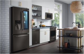
fridge.png

copper and matte black

there are many different interpretations and names but this color and finish is here to stay for 2019. copper can be used as a wall color or cabinet hardware or in a ceramic tile – don’t be afraid to use it as a pop of texture in any space. its warm and compatible with other finishes.

matte black is the go to finish now on kitchen appliances, faucets and interior door hardware. as black is not considered a “color” it is a great blender and accent. don’t be afraid to saturate a space with the right shade or if you’re a little more tempered just change out a faucet or some cabinet hardware.

burnishedgold2.png
burnishedgold.png

burnished gold

no, it’s not the polished brass we had back in the 80’s and 90’s. this finish is sophisticated and timeless. its appeal may be trendy, but the finish itself is classy and refined. i love using it in a room with no other gold tones as a light fixture. it’s unexpected and unique. take a quick glance at our “what we’re up to” section and you’ll see some ways we interpreted these concepts in a kitchen space.

kitchenopencabinets.png

open shelving

this continues to be strong in kitchens. we all first saw this come on the scene with floating shelves; as people started to embrace the concept its appeal and possibilities are endless – look at this great kitchen with a whole wall of open shelves!

barn doors

don’t forget about barn doors! they aren’t just for door openings…we’ve used them as a window covering and to cover existing doors to filter light.

the flip side is barn doors don’t have to cover or hide something. they can act as a transparent filter from one space to the next. this new door from Rustica highlights this concept perfectly! with the addition of a door like this you are also introducing some of our matte black trend to a space as well.

blue pic.png
livingroom.png