before and after photos

kitchen before

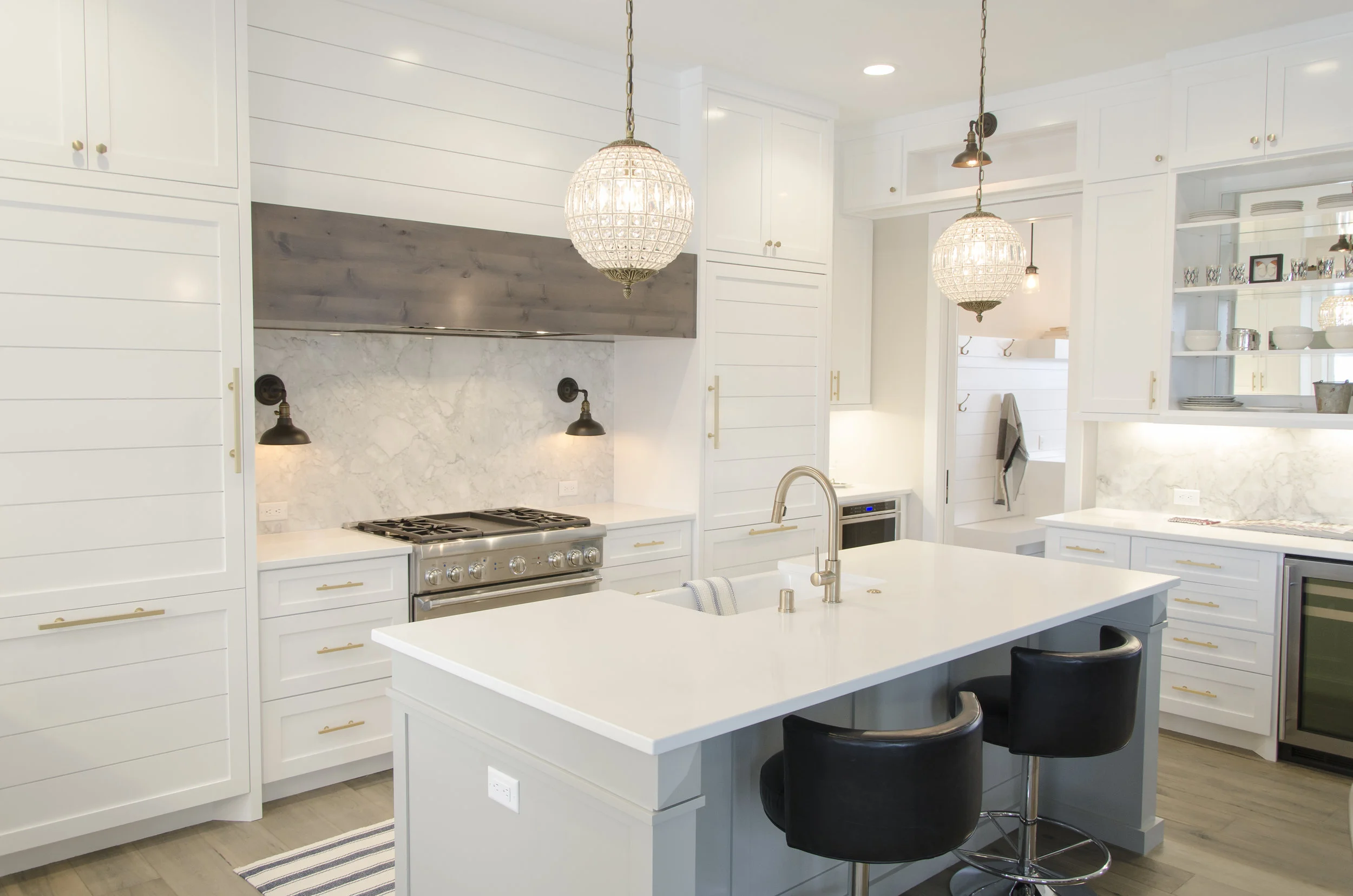
kitchen after

bedroom before

bedroom after

basement before

basement after

We love this whimsical glam dandelion wall! We designed it to be playful and sophisticated all at the same time. It shows how you can take a simple concept and put your own spin on it. It shines beautifully at night as it is embellished with mica and crystals. This was one of the items we got the most calls about when it was in a home show last year.


This is a unique way to utilize that odd space under the stairs - a hidden wine cellar. The barn door adds interest to the room whether it is open or closed and the wood walls provide a soft rustic feel.

Just another example of how impactful paint can be. Still one of the least expensive and most impactful ways to enhance and space. We used shades of blue and gray here but the sky is the limit on how you may contrast colors with this easy to achieve concept.

This window treatment is all leather - using graduated color changes and a bit of tufting it draws your eye to the center which we accented in a simple nail head pattern.

Another way to create an impact bed wall just using paint. We used all neutrals but this could be a stunning look with shades of one color or high contrast colors as well.

You don’t need a piece of furniture to have a killer headboard! We added this applied molding already primed and painted to frame our artwork and create our headboard. You could add different paint colors to this depending on your space. This room was monochromatic so we kept this all the same color.

We tied in a simple molding at the ceiling into the same room with the applied molding headboard; it adds a cohesive look and highlights the stunning chandelier.

Extending the tile onto the vanity wall creates a cleaner look and adds high drama for the vanity space.

Never under estimate the power of applied moldings and trim. This is a simple molding pattern we painted in the main trim color for texture and interest on a long wall. Without this trim the wall was challenging to bring into scale with the rest of the room. This trim allowed the wall to have visual interest for the entire space. It turned a negative into a positive feature.
If you have a long narrow space try using a herringbone or chevron tile pattern to make the room feel wider.

modern kitchen palette – still using those forever grays – crisp white – the warmth of the burnished gold and a deep bronze/black faucet accent. don’t forget to play with shapes and textures too. this photo is a great example of how a monochromatic palette can be interesting with the mosaic tile – wood inspired ceramic – chevron marble backsplash and shades of gray for the cabinetry.

add a touch of rustic glam with this wood inspired faux finish!

add a pop of a trend forward color on an interior door.